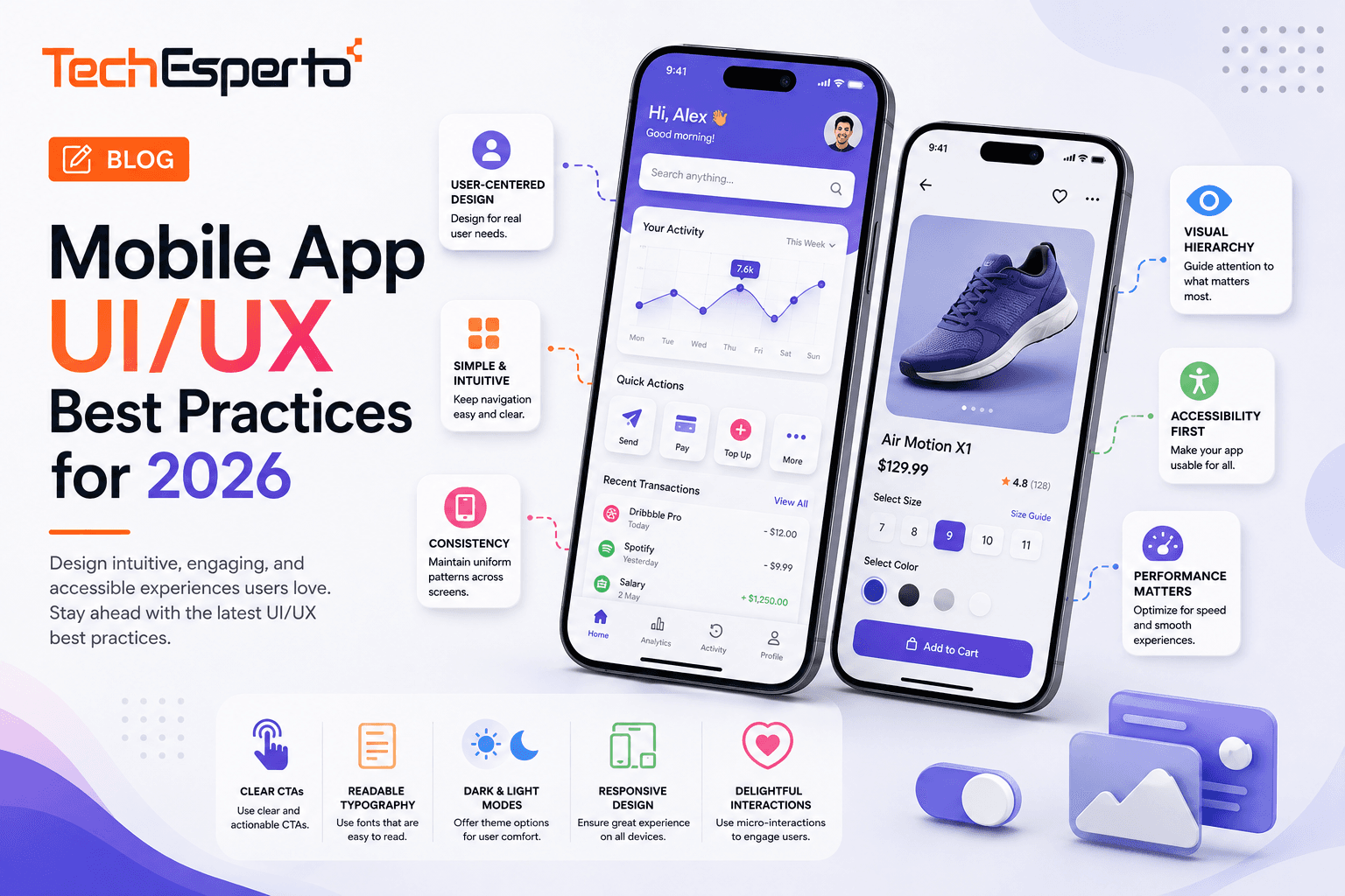
Following solid mobile app UI/UX best practices directly affects whether users stick with your app past the first session, since mobile users have little patience for confusing navigation or slow, frustrating interactions. Good mobile UX accounts for smaller screens, touch interaction, and the reality that users are often distracted or in motion while using an app. This guide covers the practices that consistently improve usability and retention. Our UI/UX design team can help apply these principles to your specific app.
Navigation & Information Architecture
How users move through your app shapes their entire experience, and mobile’s smaller screen size makes navigation clarity even more critical than on desktop.
Keep Navigation Predictable and Consistent
Users should be able to predict where navigation elements will be based on platform conventions, rather than encountering a custom, unfamiliar navigation pattern on every screen.
Limit Primary Navigation to Essential Destinations
Cramming too many items into primary navigation overwhelms users. Focus on the handful of destinations users need most often, moving less common actions elsewhere.
Design Clear Visual Hierarchy Per Screen
Each screen should have an obvious primary action, with secondary actions visually subordinate, so users immediately understand what they’re meant to do next.
Touch Interaction & Usability
Mobile interfaces are touch-first, which introduces usability considerations that don’t apply to mouse-and-keyboard desktop interfaces.
Size Touch Targets for Real Fingers
Touch targets that are too small cause mis-taps and frustration. Follow platform guidelines for minimum touch target sizes to keep interactions accurate and comfortable.
Provide Immediate Feedback for Actions
Users need visual confirmation that a tap registered, especially on slower network conditions, so button states and loading indicators matter more than they might seem.
Design for One-Handed Use Where Possible
Many users hold their phone and interact with one hand, so placing key actions within comfortable thumb reach improves usability for common one-handed scenarios.
Content & Visual Design Considerations
Mobile screens have limited space, which means content and visual design decisions need to prioritize clarity over density.
Prioritize Content Over Decoration
Mobile screens have limited space, so every visual element should serve a purpose. Decorative elements that don’t aid usability compete with content for valuable screen real estate.
Test Designs on Real Devices, Not Just Simulators
Simulators don’t fully replicate real-world lighting, screen glare, or actual finger interaction, so testing on physical devices catches usability issues design reviews alone miss.
Design for Accessibility From the Start
Sufficient color contrast, readable font sizes, and support for platform accessibility features ensure your app works well for users with visual or motor impairments.
FAQs
What’s the biggest UI/UX mistake in mobile apps?
Overcomplicating navigation and cramming too much onto each screen is one of the most common mistakes, since mobile’s limited space punishes complexity far more than desktop interfaces do.
How important is touch target size in mobile design?
Very important. Touch targets that are too small lead to mis-taps and user frustration, so following platform-recommended minimum sizes is a foundational usability practice.
Do mobile app UI/UX best practices differ between iOS and Android?
Yes, somewhat. Each platform has its own design conventions and guidelines, so a well-designed app typically respects platform-specific patterns rather than using one identical design everywhere.
Should I design for one-handed use?
It’s a strong practice where feasible, since many users interact with their phone one-handed, and placing key actions within comfortable thumb reach improves everyday usability.
How do I know if my app’s UX is actually working?
Usability testing with real users, combined with analytics on where users drop off or get stuck, gives you concrete evidence of what’s working and what needs improvement.
Is accessibility really necessary for a mobile app?
Yes. Beyond ethical and often legal considerations, accessible design practices like sufficient contrast and readable text sizes tend to improve usability for all users, not just those with specific needs.